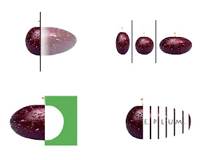
Well I have been told in every design class that we all have to get the really bad versions out to come up with something that is remotely good so I would have to say that this was the perfect example. These are just a few of the ideas and iterations I chose to show because I feel as though they show how I came to the final result the most. The first three being the process and the fourth being the final.
This blog was initially created to display work from a 100 level art course I was required to take once I transferred colleges. Now I have decided to restart my blog entries with everyday events within the last few months of my senior design studio as a member of the architecture program at the University of Maine at Augusta.
Wednesday, March 30, 2011
Logo 1: black and white
Sorry for the very out of order first series of the identity package. If anyone knows how to reorganize them please just shoot a comment.
Logo 2: E.PLUM letterhead/mission
For this mission statement I created a statement based on a company that I thought would be interesting and feel as though the E. PLUM label is just an obscure name for a company of this type. In other words it was my intention to create a company that does not necessarily fit the icon of a piece of fruit.
Tuesday, March 29, 2011
Monday, March 28, 2011
Sunday, March 27, 2011
Wednesday, March 16, 2011
Art Deco
Art Deco- again, successful? Im not completely sure. medium- ink, marker, pencil. techniques- shading and hatching.
Art Nouveau
The attempt at Art Nouveau- successful or not, I really could not decide. medium- color pencil, ink, marker. technique- shading, hatching, stippling
Wednesday, March 9, 2011
EXAGERATED plum
Exaggerated- For this portion of the text I chose a basic text and then applied a perspective application to it. After that I elongated the text and created and "exaggerated" serif.
Plum- The text again was distorted to create a heavier weight at the bottom to give the "juicy plum" idea and represent the weight of a plum sitting on a flat surface.
Subscribe to:
Comments (Atom)


